
Back story

I designed and created my old banner on Canva, and it represented who I am, who I used to be, or perhaps the right way to put it across: Who I believed I used to be!
However, I realize now that I didn't put much thought into my banner (copy and the design). While it was clean and had a bold message, there are several shortcomings in my old design:
- It didn't truly represent me. I'm not a minimalist; rather a maximalist who love colorful visual and bold textures.
- The banner failed to convey what I do, who I am, or who I help. The message lacked context and was somewhat ambiguous. Although the quote was written by me, I doubt most people would have understood it.
- Upon critical reflection, the banner felt blank and added a dull mood to my profile. Since the banner is the first thing anyone sees when visiting my profile, it’s important that it makes a strong impression.
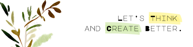
- I dont even remember why kept a plant painted in watercolor at that left corner. Maybe I would have felt cool at that point of time. It's quite in appropriate now and is not professional.

What changed suddenly?
What is going to change?
What are the initial steps?
Understanding the deeper meaning
After several iterations, I landed on:
“I turn rough ideas into resonant writing.”
What I love most about this line is the phrase “resonant writing.” I’d been searching for the right word—something that carries depth, intention, and emotional weight. Resonance felt perfect. It reflects how I aim to meet the needs of the reader, the brand, and myself: finding that sweet spot where clarity, meaning, and intent align.
Creating content with intention is far more challenging and rewarding,than writing something basic. Even though a LinkedIn banner is a small visual element, it’s the first thing people notice when they land on your profile. I wanted mine to reflect who I am and what I stand for.
The design was built on Canva. I’m not a graphic illustrator, so I made use of a ready-made illustration that spoke to me. I chose it deliberately as it reflects my persona: thoughtful, hands-on, and grounded. I still rely on pen and paper for most of my ideation and note-taking, and I wanted that analogue essence to show through.
The background is a soft gradient of blue: a deeply personal color for me. But there’s also a deeper layer to it. In Edward de Bono’s Six Thinking Hats framework, the Blue Hat symbolizes process control, reflection, and structured thinking, all qualities I try to bring into my work and writing.
Every element in the banner, from color to copy, is intentional. Nothing random. Everything chosen to echo how I think, work, and write.
Conclusion: A Small Banner, A Big Shift
This banner redesign may seem like a small update, but for me, it marks a larger transformation. It represents the clarity I now have about who I am, what I do, and how I want to show up in the world. It’s not just about better design or sharper copy—it’s about alignment. Between intention and action. Between who I am and how I’m seen.
The process reminded me that growth isn’t always loud. Sometimes, it’s quiet and deliberate, like changing your banner after three years because you finally know what you want to say. And more importantly, who you’re saying it to.
No comments:
Post a Comment